股市爆料同學會APP/WEB

Category
UI UX Design
Role
Product Design
Duration
4 Months
Tools
Figma, Adobe CC, Excel, GA4

User Retention
+200%
Community Posting
Link
🔗 Website 🔗 Donload APP
Overview
股市爆料同學會 is Taiwan's most renowned stock market community, with over one million app downloads and 600,000 weekly active users.
How can I use design and research for user growth?
Create multiple solutions for hypotheses and then conduct A/B testing.
Conduct qualitative interviews to understand user needs, pain points, and gain insights.
Perform multiple usability tests before development to understand users' perception of interface interactions, emotional experiences, and obstacles, for improving usability.
Establish design components and a color system to enhance product development efficiency and brand consistency.
Identify "key behaviors" from data to improve retention.
Club 2.0 (Redesign Club 1.0)
BACKGROUND
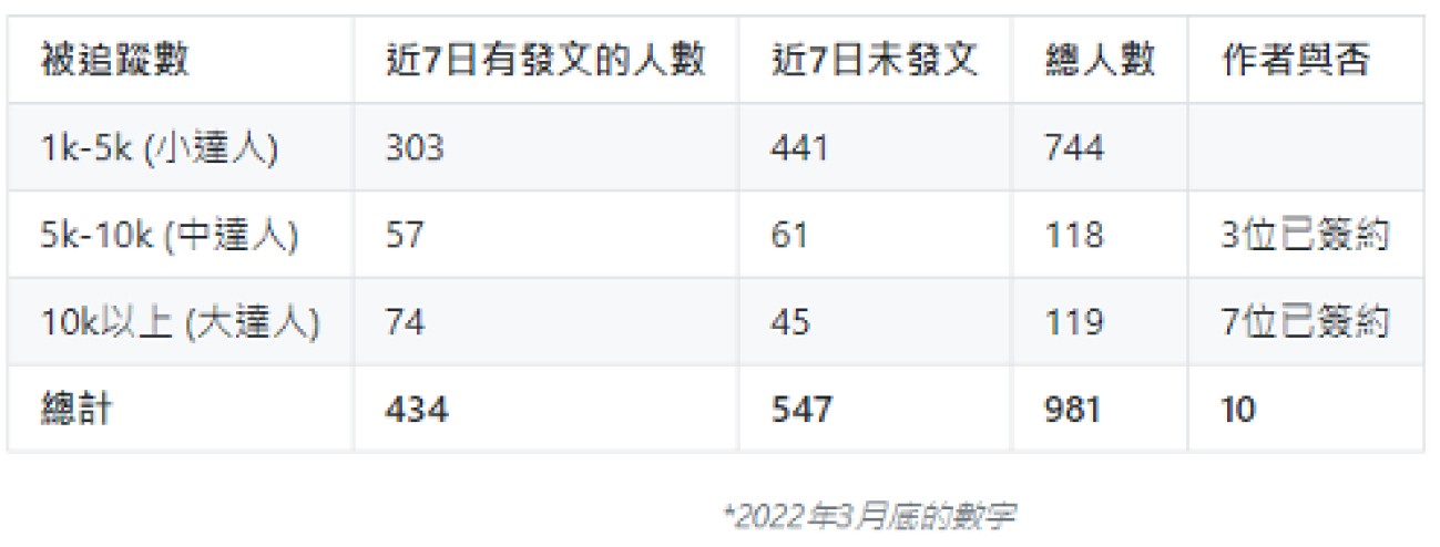
The club 1.0 had low active user numbers in the past. Through interviews with several club leaders (with fan counts ranging from 5,000 to 30,000) and by comparing with competitors in the market, we analyzed strategies to help these leaders effectively manage and activate the club, as well as considered the positioning of the club within the product.
GOAL
Member - Foster a sense of belonging among like-minded individuals in the community, where we can learn and grow together.
Director - Facilitate easier management of the community, enhancing the overall interaction experience with members.
CHALLENGE
At that time, this project encountered numerous technological constraints and legacy architectural limitations. Effective communication and coordination with other product teams were imperative. Simultaneously, we grappled with the management of numerous task priorities, ensuring the timely launch of the inaugural MVP version.
RESULTS AND IMPACT
This redesign significantly boosted our product's key metrics, with a 12% increase in community engagement. We also received numerous positive feedback from user interviews.
DESIGN PROCESS
Understanding Issues and User Pain Points
We conducted user research to gain deeper insights into the users' needs.
Defining Problems and Objectives
Hosting internal workshops, collaborating with the product team to define core issues.
Brainstorming Solutions
The team proposed hypotheses and collectively brainstormed potential solutions.
Validating Ideas through Experimentation
Conducting A/B experiments on the product, further analyzing and iterating continuously.
Continuous Optimization of Features after Launch
Through ongoing interviews with users and usability studies, identifying opportunities for optimization and using them as reference points for product development priorities.
USER RESEARCH
How to Select Interview Participants?
Communities directors of various sizes should be included.
It is preferable to have representatives from each social club platform.
Those willing to participate in interviews are welcome.
In the early stages of the project, we conducted user research to define the core user issues and gain a deeper understanding of the primary motivations behind users establishing communities. The following are key insights we gathered from this study:
"Interactivity" is the primary motive for experts founding communities.
Communities offer a variety of chat scenarios.
The main goal for community directors is feedback and giving back to members rather than financial gain.
Directors seek to reward loyal fans and may appoint them as administrators for community management.
Members lament the information overload in the community, hindering the search for specific content.
“Expressing opinions in the 同學會 may require posting a comprehensive article. Members might feel shy, unlike the casual interaction in chat rooms.”
DEFINING PROBLEMS
Posting within the community lack immediacy, hindering prompt feedback
Discussions in stock-related communities prioritize real-time interactions, crucial for frequent trading. Immediate feedback for posters enhances interactivity, serving as a key motivation.
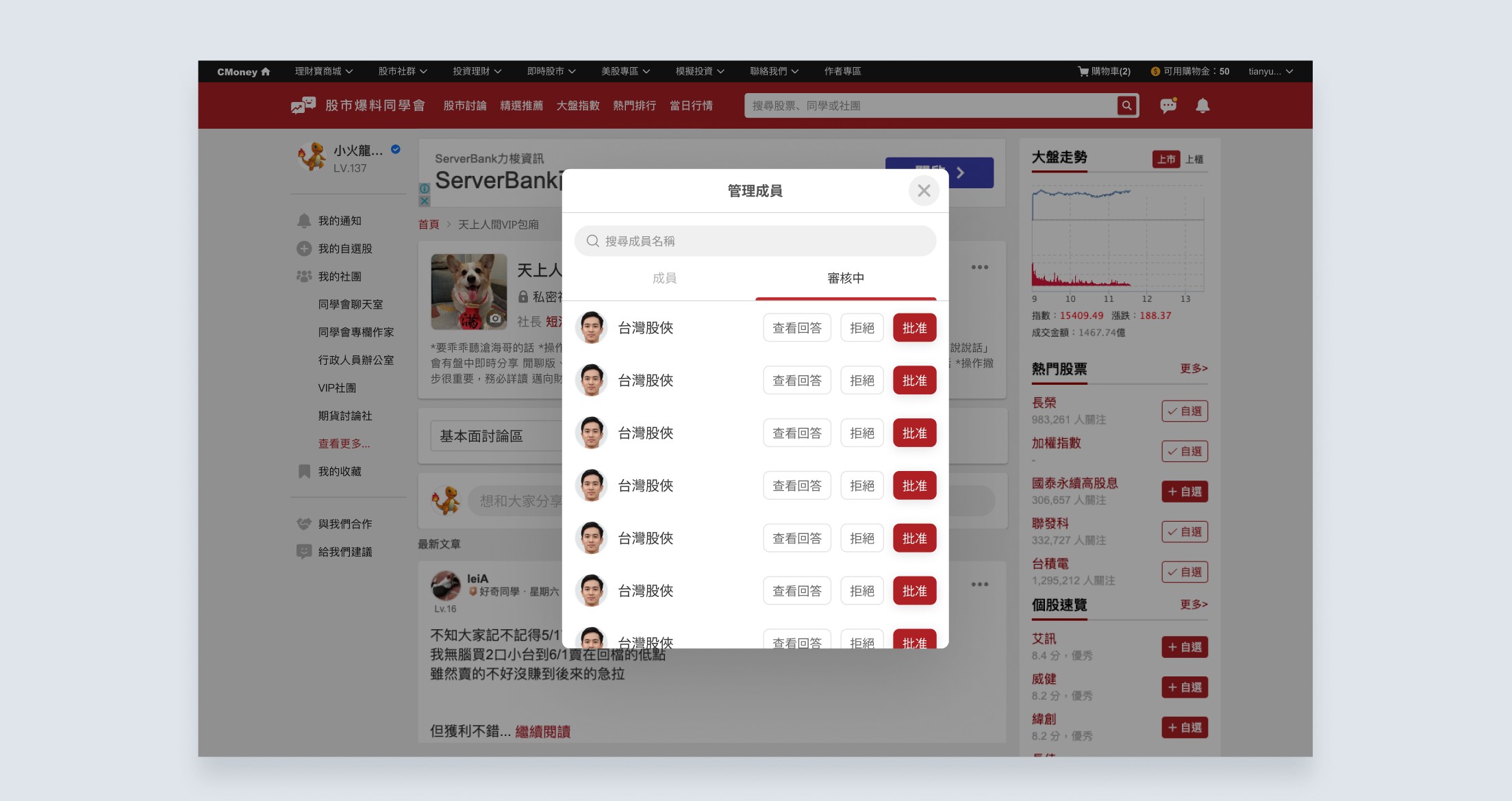
Leaders struggle to distinguish 'stan' from 'lurker,' desiring to reward 'stan' or prioritize their queries
The ability to differentiate ardent supporters ('stan') from observers ('lurker') is crucial. Leaders aim to enhance interaction and provide additional benefits for 'stan,' while concerns arise about potential negative activities by some 'lurkers,' prompting leaders to consider their removal.
Poor community search experience hampers finding needed information
Members desire an improved search experience, particularly when looking for specific content like stock or industry analysis. The current search functionality falls short of these expectations.
FORMULATING HYPOTHESES
We spent some time with the entire team, including product managers, engineers, designers, etc., engaging in a design sprint. We discussed project goals, hypotheses, constraints, and more, aiming to align every team member's vision regarding the task at hand.
In planning Club 2.0, the team brainstormed and held technical meetings to refine execution details and design directions, aiming to address user pain points and gradually introduce more features post-launch.
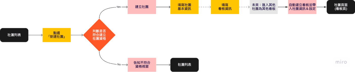
👆🏻In the final discussions, we generated numerous specific ideas and outlined the community creation process. This will aid me in quickly delving into practical design solutions.
💡Here are several focal points for the current design optimization:
Immediacy
Swiftly gathering fan feedback
Confidentiality
Engaging in profound exchanges with like-minded users
Interactivity
Providing added benefits to devoted fans
Usability
Improving the article-searching experience
Diverse Scenarios
Segmenting interactions for users with varied experiences and perspectives
Our hypotheses
By optimizing the article search functionality within the community, users can more easily locate the desired content.
By creating distinct boards within the community, users can concentrate on specific types of discussions, thereby enhancing the overall activity of the community.
PROJECT OBJECTIVES
By encouraging users to actively engage with community content, we aim to enhance user participation in the community (commenting and posting).
After several team discussions, we have defined the feasible scope for the initial version. The focal point of the upcoming "Club 2.0" launch is to attract like-minded individuals to join the community and encourage members to actively participate in discussions. This ensures that the content generated within the community is actively discussed. It includes:
Diverse Chat Scenarios
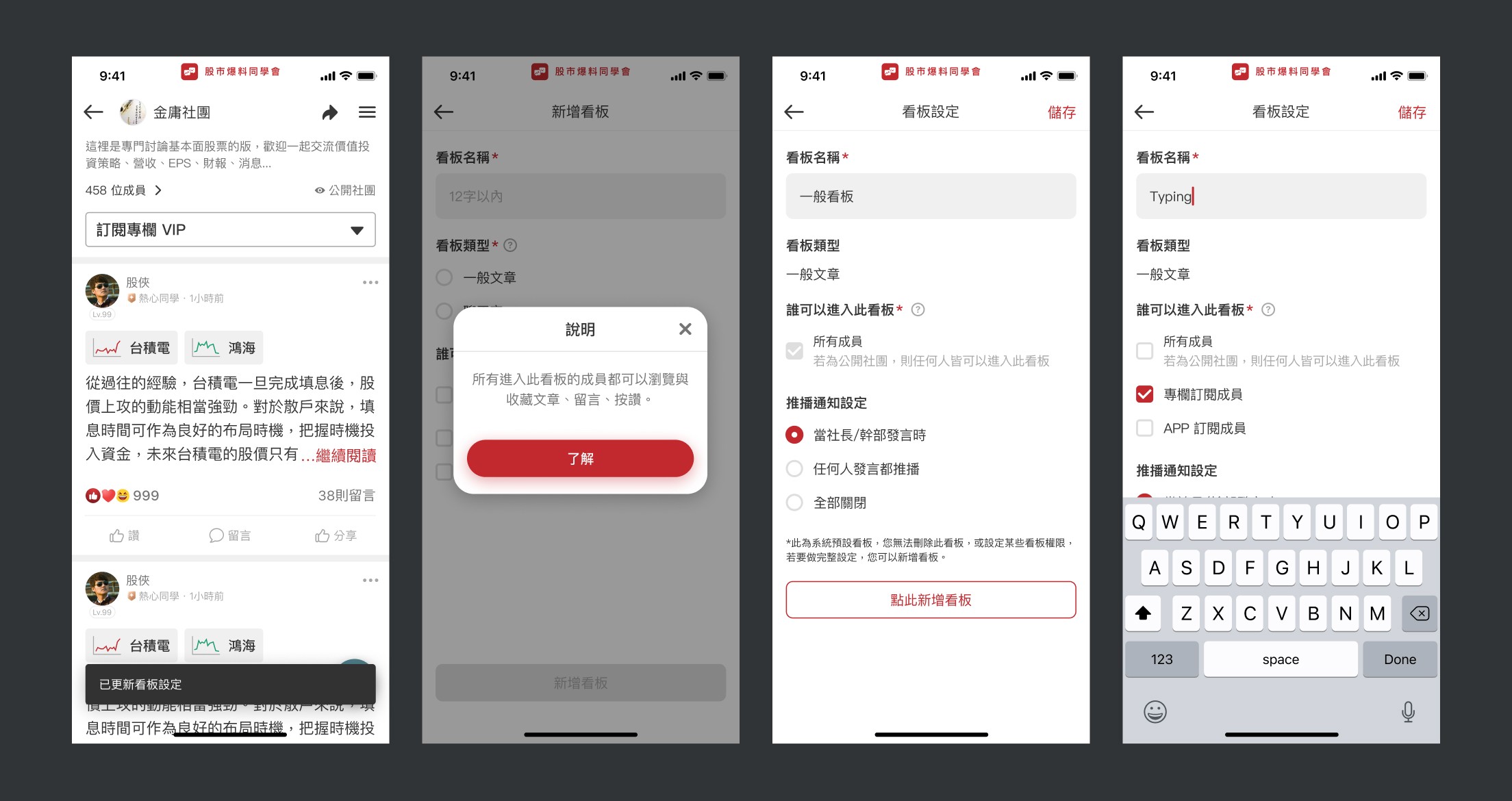
Introducing board categorization within the community to meet the needs of both leaders and members. This feature enhances convenience in managing and finding different types of articles and provides modular boards for use in other projects.
Revamped Community Content Search Experience
Enabling keyword searches for stock codes, names, and more within the community to find relevant articles, catering to the information retrieval needs.
Increased Visibility of Community Features in the Product
Integrating features such as sharing community links, showcasing community exposure sections, and displaying community articles on the homepage to facilitate easy access and browsing for members.

DESIGN PRINCIPLES
Consistency
Addressing inconsistencies in Community 1.0, the redesign of Community 2.0 establishes a dedicated design system for the new community pages. This ensures a uniform user experience across devices and various product pages.
User-Friendly
Through multiple usability tests and interviews, we've crafted a clear and intuitive user experience. The usage process is designed to be straightforward, aligning with user habits and presenting essential functions in a familiar manner.
Clarity
ITailored for an older demographic, visual indicators and text are kept concise, ensuring clarity and easy understanding. Consistent language usage is emphasized to enhance comprehension.

DESIGN OUTPUT
Here are the functionalities and subsequent optimizations implemented in the initial release:
👉🏻 Diverse conversational settings
Added community bulletin board functionality. Click the dropdown menu on the community's homepage to freely switch between different themed bulletin boards.

👉🏻 Enhanced visibility of community features in the product
Introduced a share link button on the community page and displayed community articles on the product's homepage. This aims to increase entry points to community articles, thereby boosting overall community engagement.
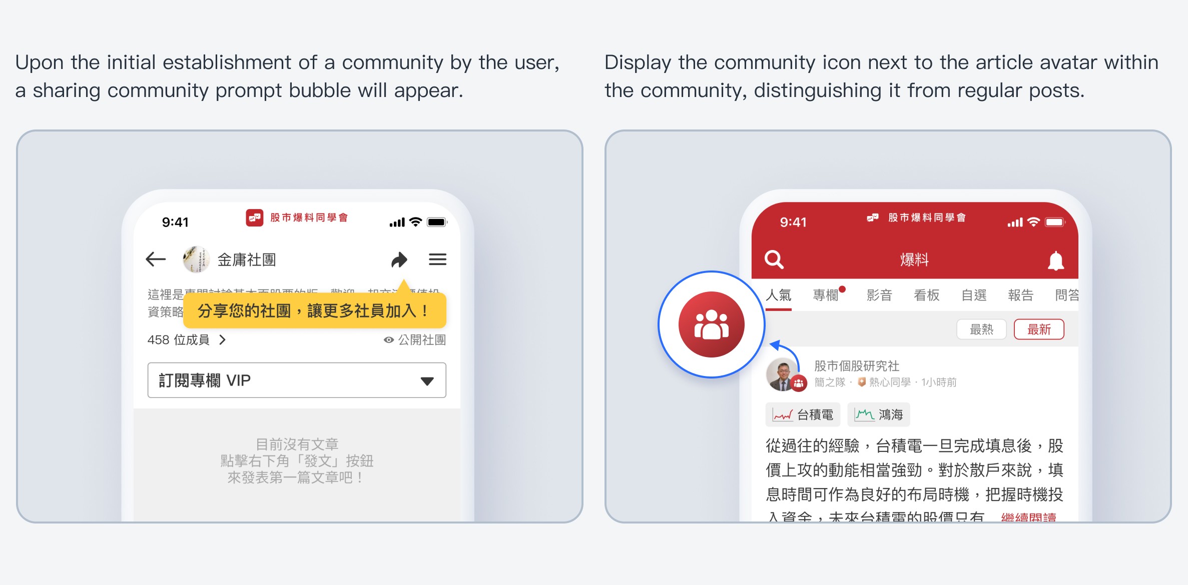
For further optimization, to expose more thematic communities, incorporated a recommended communities section on the highly clicked search page. Also, added a "Communities" tab to the navigation bar for users to swiftly access community pages and explore a variety of topics.

👉🏻 Refined community search experience
Clicking on the community's internal search bar allows users to search for desired stock articles or users with improved efficiency.

👉🏻 Establish a consistent user interface within the product
Adjust the web version's community information UI to streamline the information structure, integrate member-specific actions, and maintain consistency with the app's user experience.

Refined Focus -
Adjust and simplify the community information UI by incorporating design elements from the new Club 2.0. Maintain a consistent visual style and enhance the reading experience.
Integrate member-specific actions, streamline the information structure, and ensure consistency with the app's user experience.
PROJECT DELIVERABLES
Following the launch of Community 2.0, we conducted user interviews and usability tests to enhance user experience. The redesign successfully increased community engagement and received positive user feedback.
(2022/9/1-2023/2/14)
Increase the retention rate for the first month by 5% (from 72% to 76%).
Elevate the retention rate for the second month by 11% (from 53% to 59%).
Enhance the retention rate for the third month by 19% (from 46% to 55%).
Augment the number of posts in the community by 76% (from 170 per week to 300).
Amplify the volume of community posts by 200% (from 600 per week to 1200).

REFLECTION AND LEARNING
The Community 2.0 redesign was a collective effort from every team member, who worked diligently to bring this new version to fruition. Through numerous A/B tests and user interviews, we gathered valuable data and insights that aided in forming hypotheses and incrementally refining and improving community features.
I believe that after the product's launch, there will inevitably be challenges both technically and in terms of user experience. It's unrealistic to expect universal satisfaction with the new version. Product development is an ongoing journey, and in this process, delving deeper into user perspectives, addressing user pain points, and fostering user reliance and fondness for the product is where the true value of product design lies.
Thanks for watching.🫶🏻