B2C E-commerce Website Redesign

Category
UI UX Design
Role
Product Design
Duration
5 Months
Tools
Figma, Adobe CC, Hotjar, GA4

Transaction Conversion Rate
+9%
Shopping Cart Abandonment Rate
Link
🔗 Website
Overview
理財寶商城 is a major e-commerce site selling 800+ investment software products, offering online courses, and serving as the company's primary trading platform.
Product Page Redesign
BACKGROUND
Data shows a high bounce rate of 76% on software product pages, with 65% of users only viewing one-fifth of the page. The conversion rate for adding products to the cart is below 6% (market average is 7-8%). This indicates a mismatch between user expectations and the information presented. Thus, the initial step in the redesign is to adjust the information presentation on software product pages.
GOAL
Enhance user understanding of product information, reduce search costs, and improve usability.
Improve mobile browsing experience.
Define website design systems and standards to lower maintenance and design costs.
CHALLENGE
Conflict between user's existing habits and UX principles -
Significant design changes may lead users to unfamiliarity with the new interface, increasing the transition cost in learning operations and resulting in a decline in PV and revenue.
RESULTS AND IMPACT
Transaction conversion rate increased by 6%, and shopping cart abandonment rate decreased by 9%.
DESIGN PROCESS
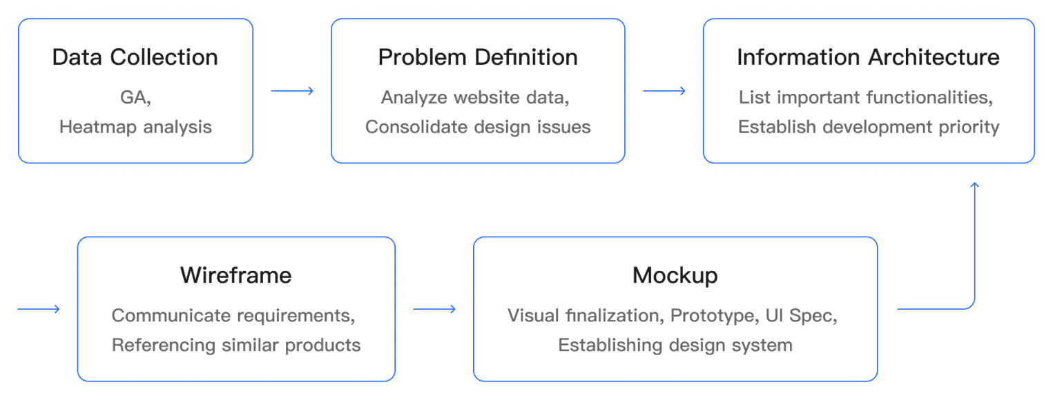
Conducted initial data analysis through GA and heatmap insights to understand user pain points and high-traffic areas on the website. Compiled key functionalities and explored design opportunities to enhance critical performance indicators.
Engaged in discussions with various product teams to ensure alignment of website information with all product requirements. In the design phase, referred to mainstream e-commerce websites for screen layout, minimizing disruptions to users' established habits.
Developed Wireframes to finalize component placement on the screen. During the Mockup stage, visual refinement took place, and any identified issues might prompt a return to the functional planning step for reevaluation, thus iteratively progressing through the design process.
DEFINING PROBLEMS
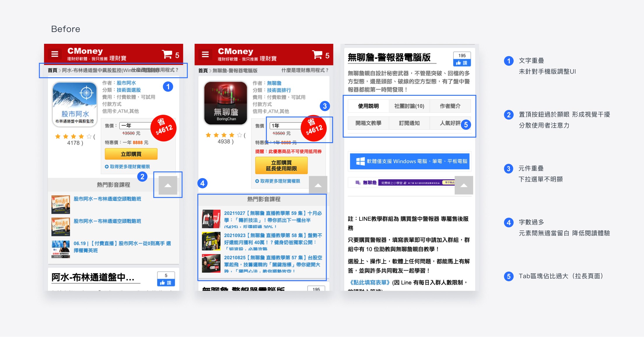
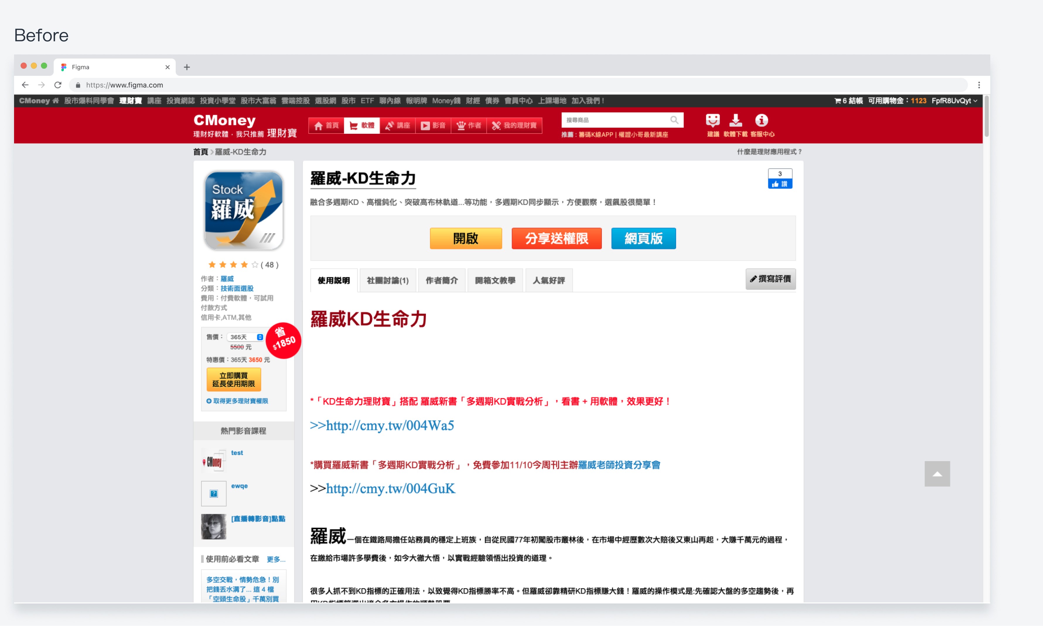
Unclear visual hierarchy, making key information less noticeable.
First screen content lacks focus, including less important information with low click-through rates.
About half of users browse via mobile, but the mobile version has a subpar interactive experience.
Absence of a cohesive design system; excessive components, shadows, and gradients create visual distractions.

🔼 The product page before the redesign
FORMULATING HYPOTHESES
Due to the widespread impact of the product page redesign, we held multiple meetings involving engineers, product managers, and marketing teams. These discussions focused on aligning everyone's understanding of project goals, assumptions, and limitations.

In the end, we generated numerous concrete concepts and wireframes, outlining their respective merits and demerits. This significantly aided in swiftly delving into specific and viable design solutions.
Our hypotheses
By anchoring the Call to Action (CTA) and presenting all pricing plans at once, users can efficiently compare products that best suit their needs.
Improving the user interface and visual design to present clearer and more structured information can assist users in discovering products that align better with their preferences.
PROJECT OBJECTIVES
Enhancing the user's experience in browsing product pages, aiding them in discovering items that best suit their preferences.
It includes:
Clarity in Pricing Plans
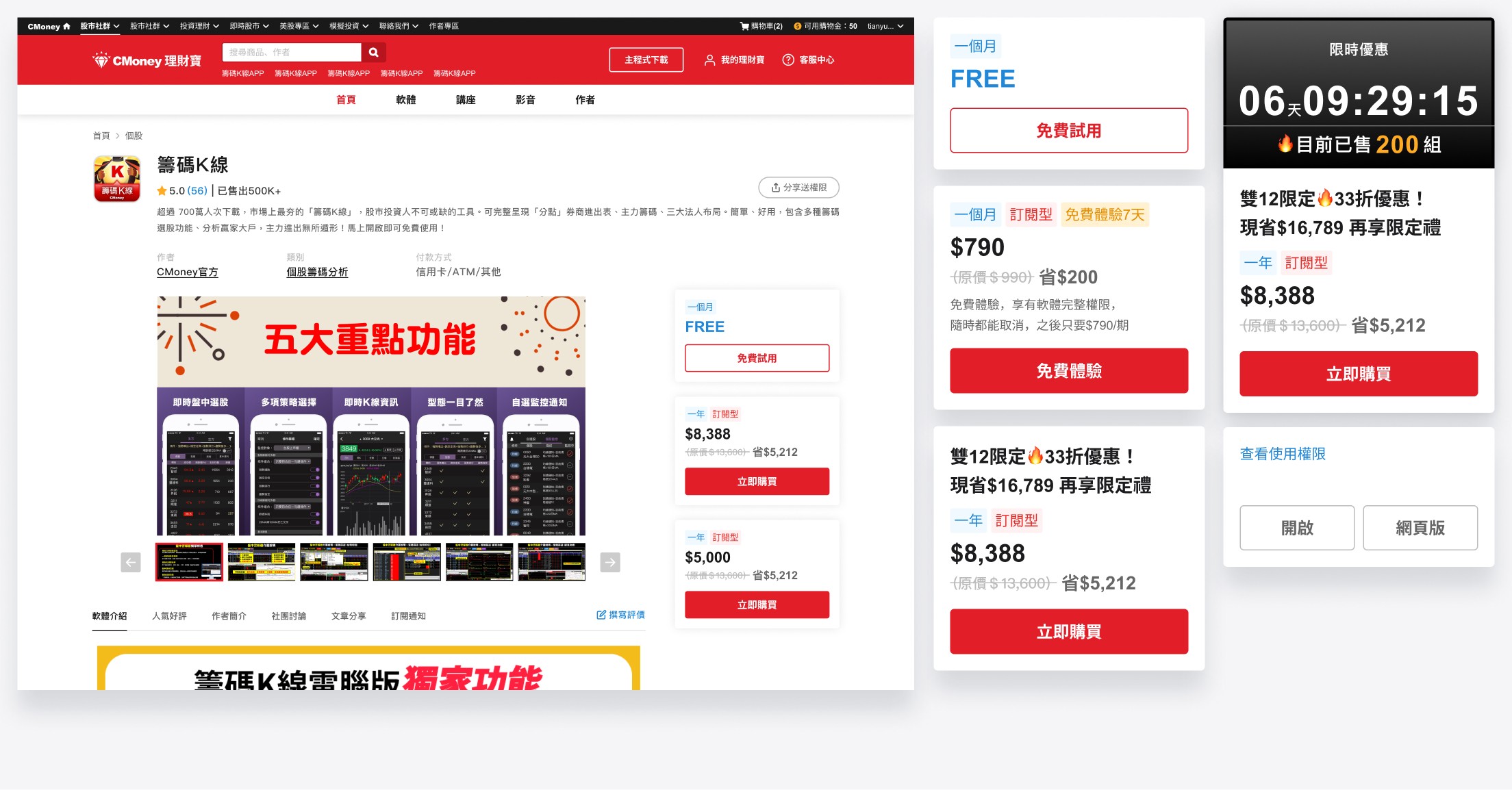
Display various pricing plans on the right side of the page, fixed in the sidebar for user-friendly comparison and reference.
Streamlined Content
The prior product page displayed redundant and less essential information, negatively impacting the user's browsing experience. The new version optimizes by removing less-clicked details, directing the user's focus to key sections.
Mobile Optimization
As nearly half of our traffic originates from mobile devices, the previous version lacked mobile responsiveness, causing layout issues. The new version prioritizes enhancing the mobile user experience.
DESIGN OUTPUT
Here are the primary features implemented in the first version upon launch, along with subsequent optimizations:
👉🏻 Pinned Pricing Plans
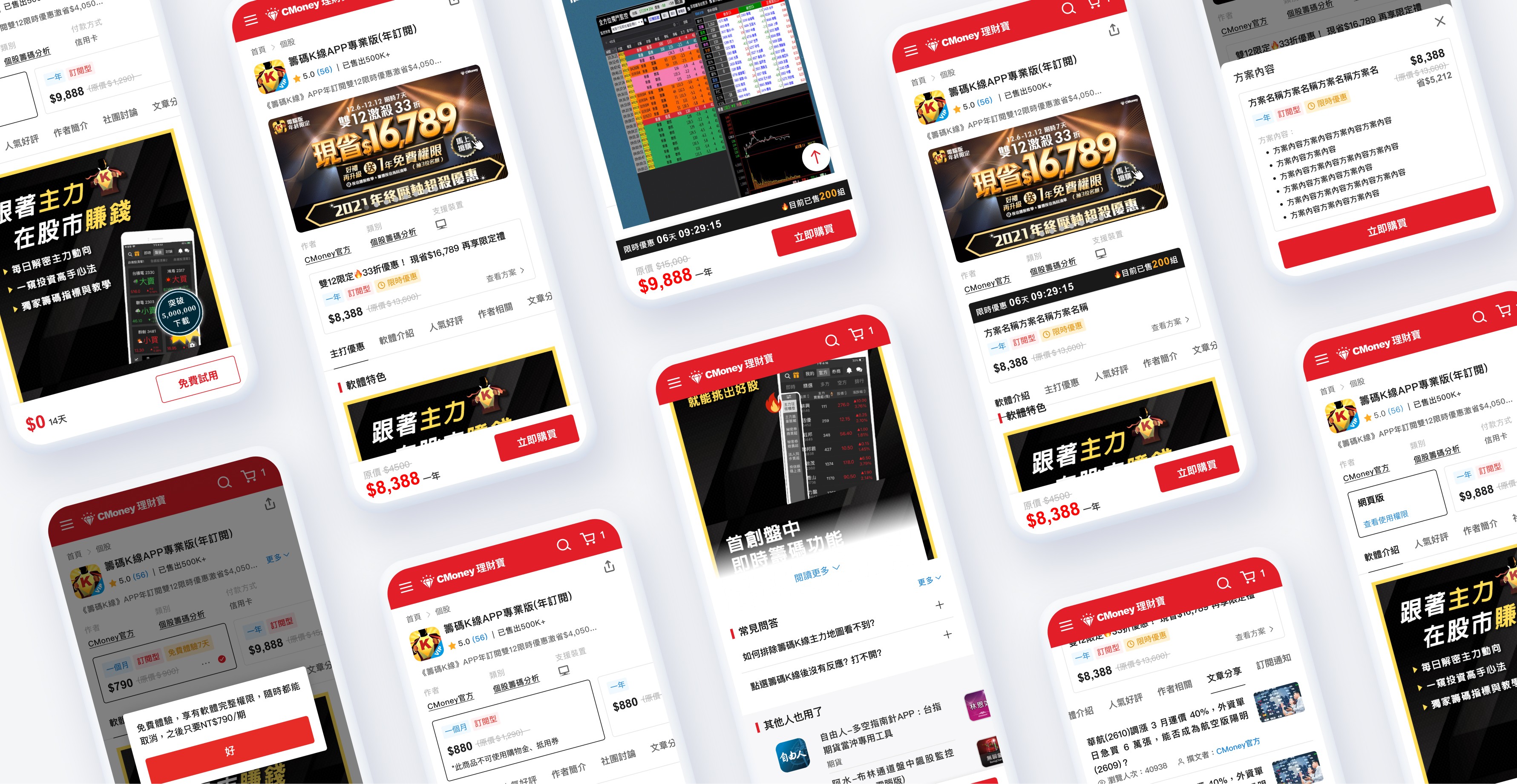
On the desktop version, different plans are fixed in the sidebar, while on the mobile version, they are fixed at the bottom of the screen. This facilitates user comparison and reference. Additionally, price and plan duration labels are added, clearly distinguishing differences between various plans.
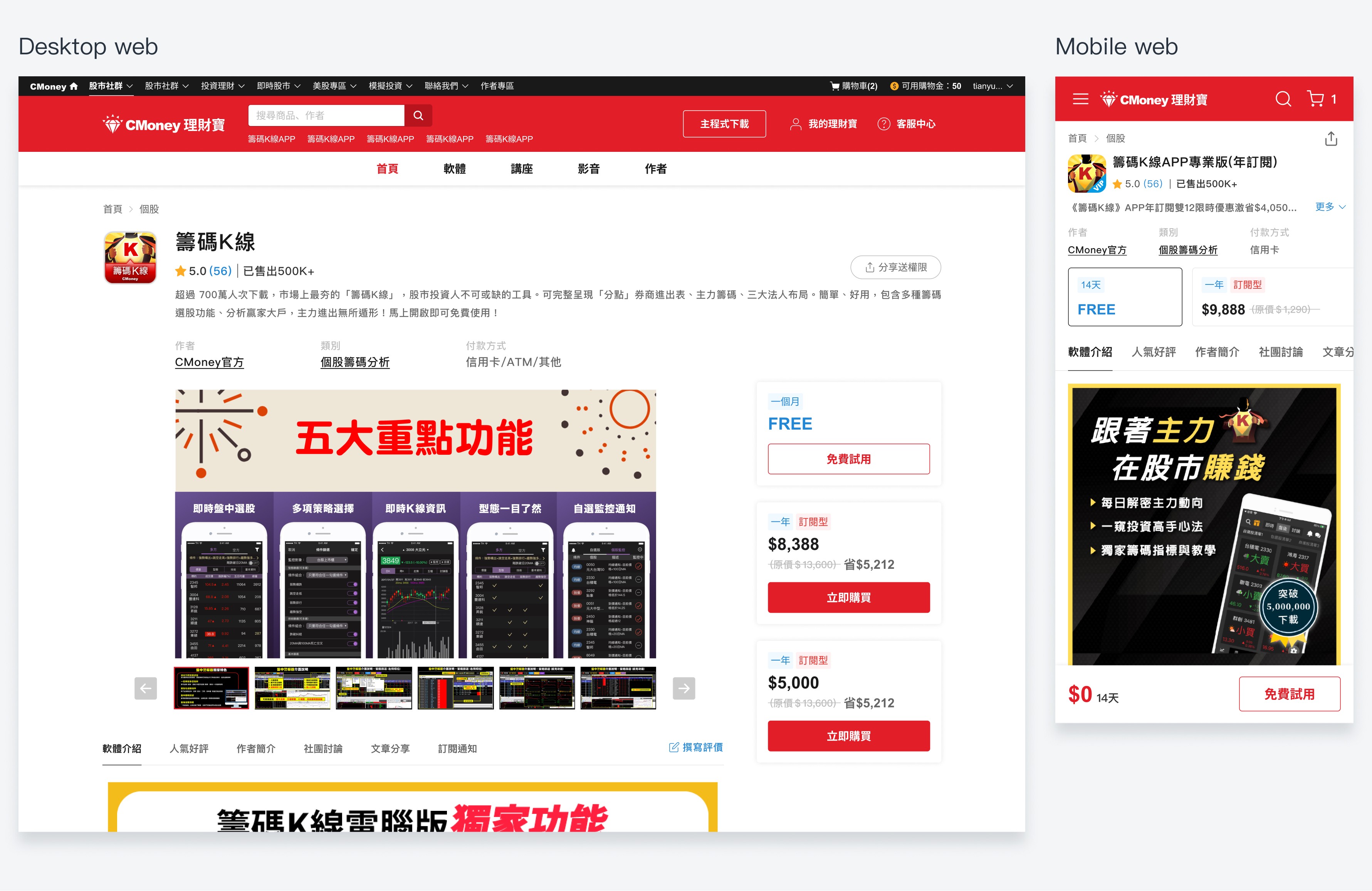

🔼 Cards for Various Plans and Engineering Specifications
👉🏻 Clearer Page Information
I revamped the visual presentation of the product page by removing and simplifying non-essential details, creating a more concise and readable layout. I established clearer visual hierarchies based on content importance, increased whitespace, and reduced visual clutter. Additionally, a design system was implemented for consistency across the entire website.

👉🏻 Adding Product Description Carousel
Incorporate a product description carousel on the first screen of the product page. This allows users to quickly grasp product information and highlights as soon as they enter the page, enhancing their inclination to continue scrolling.

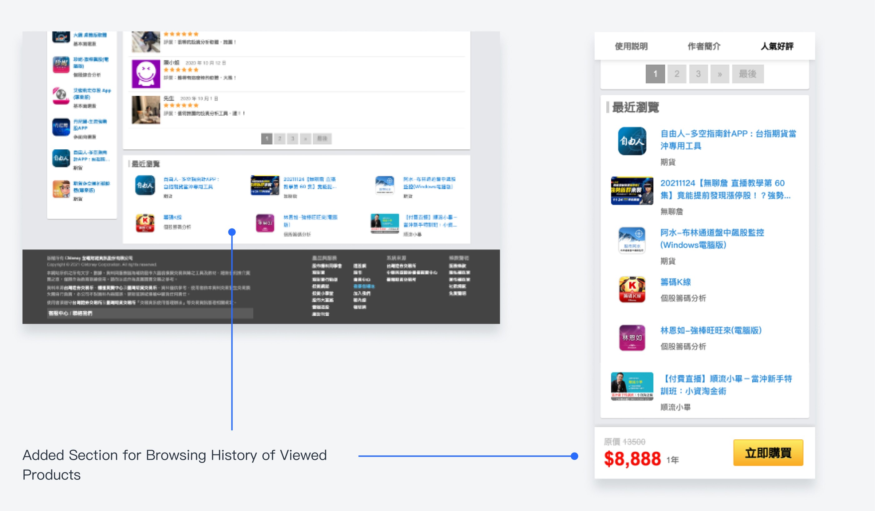
👉🏻 Added "Others Also Used" and "Recently Viewed" Sections
Through qualitative research using Hotjar, we identified that users face difficulties in finding previously browsed products, leading to suboptimal navigation back to the product overview page. In response, the new design integrates a browsing history feature for users to swiftly locate their past viewed products on any product page.

PROJECT DELIVERABLES
To ensure the new version positively impacts both business and users, we conducted A/B testing with minimal development costs, observing data variations between different versions. The optimized version, in the end, achieved significant success, notably improving key business metrics.
Below are some minor adjustments made before the redesign:
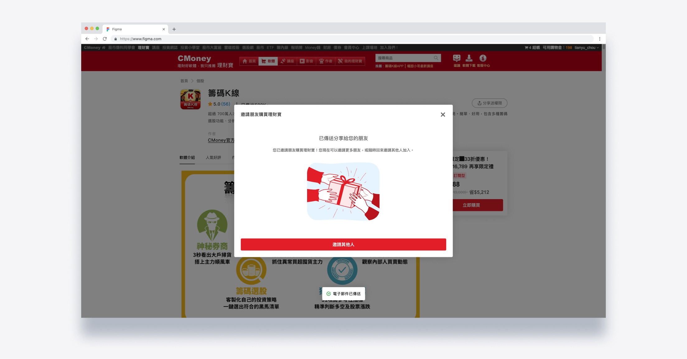
In a quest to elevate user conversion opportunities, an endeavor was made to introduce a purchase floating button, guiding users to click and add items to their shopping carts. Within one month of implementing this feature, there was a commendable enhancement, with a 9% surge in transaction conversion rates.

Added a browsing history section at the page bottom for users to quickly find past viewed products and boost cart additions. Within a month, the cart addition rate increased by 13%, and the product page views surged by 3.4 times.
After multiple rounds of data validation, confirming that our proposed hypotheses had a positive impact, the key adjustment elements were incorporated into the new design. Overall, the redesigned version increased the transaction conversion rate by a total of 6%, while the cart abandonment rate decreased by 9%.
REFLECTION AND LEARNING
This redesign of the product page has been a highly impactful project, not only affecting the revenue of multiple product teams within the company but also presenting a challenge for users as it conflicts with their existing usage habits and the principles of a good user experience. Any major design changes can result in user discomfort with the new interface, increasing the risk of a decline in PV and revenue due to the transition cost in learning operations. Over the past few months, team members have been consistently discussing how to prepare for A/B testing to gain insights. Gaining support from the company's leadership and different product teams for the direction of this project has been crucial. If the first version fails, what the next steps will be is an uncertainty. I believe these questions may not have absolute answers, but the team holds strong assumptions, believing that these changes will benefit our users.
Through this project, I have come to understand that significant changes may bring higher risks but can also result in more substantial impacts. Incremental experiments may slow down development efficiency but provide a safer approach. Finding a balance between time, resources, constraints, and goals is crucial. I have also learned that prioritization is essential within a team, and when done effectively, it can enhance development speed and focus on genuinely valuable tasks.
Thanks for watching.🫶🏻