顧家醫療GU+ Medical Group

Category
Branding
Role
Brand Design, Signage Design
Duration
6 Months
Tools
Adobe Illustration

Overview
GU+ Medical specializes in urology, with two Taipei clinics dedicated to expert patient care.
Visual Identity
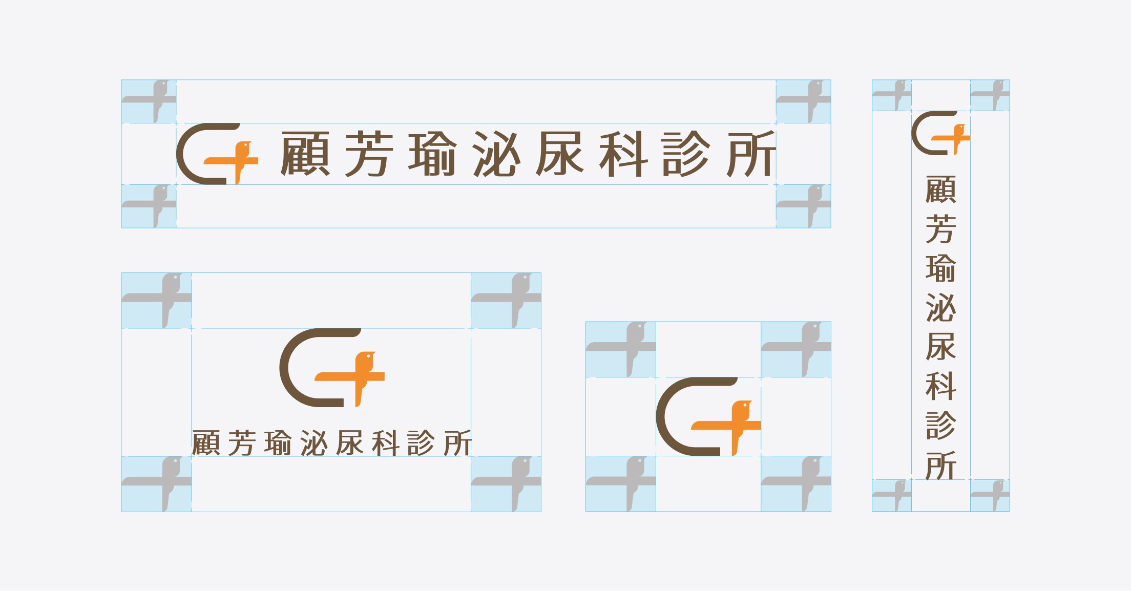
The English phonetic spelling for the Chinese character '顧' in Dr. Gu Fangyu's name is GU, which is also an abbreviation for urology. Therefore, the inspiration for the logo is derived from the English letter 'G.' The design incorporates a cross symbolizing medicine and merges it with the image of a bird from the personal brand 'Bird Scientist,' deepening its brand impression.
The color scheme adopts warm and calm earth tones to convey a sense of trust and professionalism. Complemented by the warm orange color within the same spectrum, it creates a warm and relaxing visual impression, conveying a comforting atmosphere associated with the brand.